
Writing for the F-Pattern
The Writers' Table 2A

This is article 2A of The Writers’ Table.
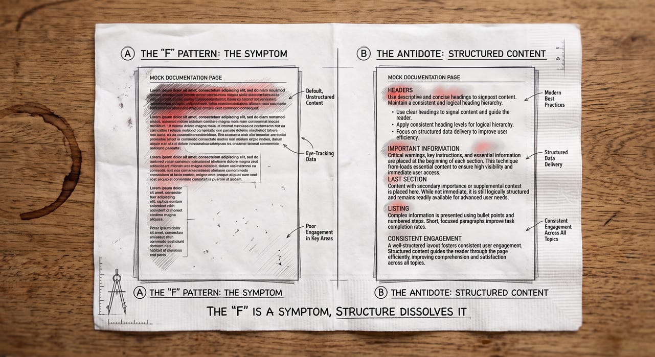
The F-pattern is a symptom, not a reading style to design around. Writing for it doesn’t mean shaping prose to survive the scan. It means writing so the scan never starts.
In 2006, Nielsen Norman Group published eye-tracking research showing how users read web pages. The finding was blunt: they don’t. They scan. And on unformatted, prose-heavy pages, the scanning pattern looks like the letter F. A horizontal sweep across the top, a second sweep a little further down, then a quick vertical scan along the left margin, trailing off as it goes.
Writing for it doesn't mean shaping prose to survive the scan. It means writing so the scan never starts.
NN/g revisited the study eleven years later, in 2017, to check whether the pattern still held. It does, with refinements for mobile and for Arabic (RTL) reading. But the follow-up made a point that’s easy to lose when people cite the original: the F-pattern shows up specifically when a page gives the reader nothing but undifferentiated text to search through. Give that same reader real headers, front-loaded points, and bolded terms to anchor on, and the eye stops tracing an F. It jumps straight to what it needs. NN/g calls these the F-pattern’s antidotes and names other scan shapes (layer-cake, spotted, marking, bypassing) that show up once a page is actually structured.
So “writing for the F-pattern” means writing so the F never forms, because the reader found what they needed in the first two lines and didn’t have to keep scanning.
What Happens at the Top of the Page
The top of a page gets the most sustained attention: the first horizontal stroke of the F, before attention drops off. The first heading, the first sentence, and the first two or three lines of body text are the only content most readers engage with carefully. If the point of a section isn’t visible in those first lines, most readers skip the section.
This gets more urgent on mobile. A narrow viewport compresses the F: the first horizontal stroke is often the entire visible screen, and everything below the fold competes for a scroll the reader may never make. The 2017 study found the pattern holds on phones, just more tightly. Front-loading isn’t a nicety there. It’s the difference between the point being on screen and being one swipe away.
The essay structure that English composition classes teach — setup, context, thesis — is exactly backward for documentation. You shouldn’t build to your point. You should lead with it, then support it.
Compare two ways to start a password-reset procedure. The wrong one buries the instruction: “Passwords are an important security measure. If you’ve forgotten yours, the following steps will help you regain access.” By the time a reader in a hurry reaches the actual step, they’ve scanned past it. The right one leads with the action: “To reset your password, go to Account Settings.” The reader who needs it is already moving.
Progressive Disclosure
The F-pattern findings point toward an older UX principle: progressive disclosure. Present only what the reader needs at each stage, and layer complexity behind navigation or interaction. Different research, same direction for documentation structure.
In practice, a procedure should tell the user what to do before it tells them why. The “why” belongs in a separate concept or explanation page that readers can choose to visit or not. A setup guide with five steps should not open with three paragraphs on the product’s architecture. Lead with step one. Link the architecture explanation for readers who want it.
None of this is condescension. It’s structural respect for the reader’s time and purpose. A reader who wants the architecture context will click through for it. A reader who doesn’t shouldn’t have to scroll past it to find step one, and shouldn’t have to guess whether it hides something they need.
The Strategic Use of Headers
Headers in documentation aren’t decorative. They’re navigation infrastructure. A reader scanning the left margin is using your headers as a table of contents in real time, deciding section by section whether it’s relevant to the problem in front of them. This is the layer-cake shape from NN/g’s list: the eye reads headers and opening lines in horizontal stripes, skipping the filling between. A well-titled header and a front-loaded first sentence are the two layers that the reader actually consumes.
Headers in documentation aren't decorative.
Headers should describe what the section delivers, not what it discusses. I’ve made this edit hundreds of times, and it’s almost always the same move. “Authentication” is a topic label. “Configure OAuth credentials” is a task label. The first tells a scanning reader nothing actionable; the second lets them judge, immediately, whether they’re in the right place. When I restructured a set of API error pages recently, the single change that helped most wasn’t rewriting the bodies. It was turning topic-label headers (”Error handling”) into result-label headers (”Retry a failed request”).
The same rule applies at smaller scales. Bold text within a paragraph draws the eye during an F-pattern scan. Use it for terms the reader might be scanning for: product names, field names, menu items, warnings. Don’t use it for emphasis on adjectives or general conclusions. The eye will hit it mid-scan, and the reader won’t understand why it’s highlighted.
Breaking Up Text
Long paragraphs are scan barriers. A block of 150 words with no visual relief tells a scanning reader that the section probably has something in it, but finding it will cost you. Most will skip the block.
Not every paragraph should be three sentences, though. Some arguments need space to develop. But when a paragraph runs long, ask whether it’s long because the idea requires it, or because you haven’t found the right structure yet.
Common fixes: split the paragraph at its natural clause boundary, extract a key term into a header, or convert a list embedded in prose into an actual list. Bulleted lists trade the connective tissue between ideas for scannability. That’s a reasonable trade when the items are genuinely parallel, and the reader might need to locate a specific one, not when you’re chopping prose just to shorten paragraphs.
The test is always the same: can a reader scanning this page at speed find what they need? If the answer depends on careful reading, the structure needs work.
Where the F-Pattern Doesn’t Apply
The antidotes describe what to do with reference and task content, not everything a technical writer produces. A conceptual deep-dive that a reader has deliberately chosen to read closely — a design rationale, a migration guide someone is reading end to end before a big change — gets read more linearly, closer to how people read a printed article. There’s no F-pattern to prevent because the reader isn’t scanning. They’re reading. Chopping that kind of content into scan-optimized fragments produces choppy, hard-to-follow prose for no benefit. Know which mode your document is in before you restructure it.
The Other Reader That Scans
Your documentation now has a second scanning reader: the retrieval pipeline behind an AI assistant. When a support bot or AI search answers a question from your docs, it doesn’t read the page. It splits the page into chunks — typically at header boundaries — and pulls the few that best match the query. Each chunk is judged out of context, on its own.
Every F-pattern antidote helps this reader, too. A task-label header (”Retry a failed request”) gives the chunk a retrievable name; a topic label (”Error handling”) doesn’t. A front-loaded first sentence puts the section’s point exactly where retrieval and the generated answer will land. A section that buries its instruction under three paragraphs of preamble loses the human scanner at line two and the machine at chunking time.
That’s not a coincidence. Structure that tells a hurried human where the answer is tells a machine the same thing. Write so the scan never starts, and you’ve also written so the retrieval doesn’t miss.
Structure that tells a hurried human where the answer is tells a machine the same thing.
Further Reading
Nielsen Norman Group, “F-Shaped Pattern of Reading on the Web: Misunderstood, But Still Relevant (Even on Mobile)” (2017) — the follow-up study, the antidote list, and the other scan shapes. nngroup.com
Nielsen Norman Group, “F-Pattern in Reading Digital Content” (video) — a short companion piece that addresses mobile scanning specifically. nngroup.com
What You Can Do
Take a task or reference document you’ve written — a procedure, a how-to, an API page, not a design rationale meant to be read end to end. Read only the first sentence of each paragraph.
Does that reading give you a complete picture of what the document covers? If key points hide mid-paragraph, move them to the front.
Thursday: Plain Language Is Not Dumbing Down — the most common pushback technical writers face, and how to answer it.